With the US close to full employment, for employees, health benefits could matter more. Many prospective hires are rightly fixated on salary, bonus, growth, and purpose but draw blanks on benefits. “The company offers a few plans and I pay around $1,000 year in premiums” is the usual type of analysis, if at all. Some dig deeper and look at copays or drug formularies. The employer portion of premiums is typically $5,000-6,000 and is growing twice as fast as inflation–that amount is real, and to the employee, it’s felt through foregone wages, but hidden in box 12ish of a W2. For all the fresh salmon lunches, low deductibles, and on-site laundry services that outlier firms in sunny California have, the rest of the country looks more like average deductibles of $1,500+ and pre-soccer practice rush hour dry cleaning drop-offs.
One reason employees are out of the loop is asymmetry. The employer knows more and is writing the checks. With the help of a broker, they choose the menu of plans, ancillary vendors, wellness-eque feel-good stuff, step trackers, gym memberships, health coaches, vision insurance, and more, all of varied value.
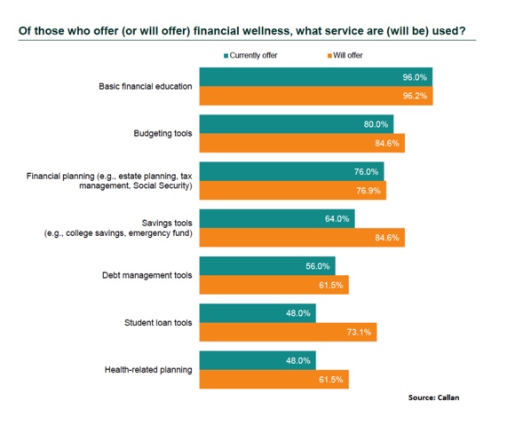
More new programs are emerging, such as financial and student loan tools and assistance, as well as health education and literacy. See Quizzify.

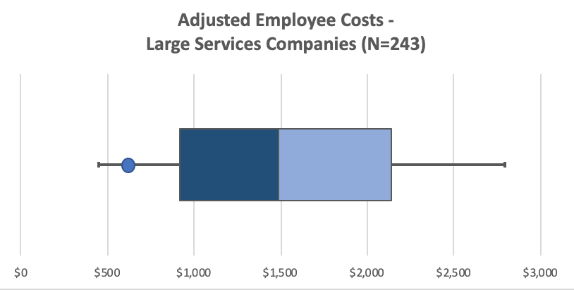
But to compare the core health benefits, what do you do? The below shows a summary of data from the 2018 Kaiser Employer Survey for those with individual coverage for 243 large (1,000+ employees) services companies. The value includes ranges of employee payments, less any health savings type contributions, and adjustments for differences in benefit coverage levels–plan designs are normalized and premiums adjusted using some smoothing verified by my FSA actuary friend. An employee for XYZ corporation represented by the blue circle pays $600/year, or 50 bucks per month. While the one near the top is over $2,800. Companies like Google (though a different industry) may be negative since the benefits are so rich and the contributions from employees are close to zero.

Whom does this help? For the 20-30M who start new jobs each year, it’s data that shows you’ve done research. That can’t hurt. Employees just want coverage and they want to know how much and what to expect. They don’t care if a logo says Cigna or UHC. It also exposes the differences companies pay and what they attract and the subtle messages they send. Some firms are very generous with employee benefit contributions, which average around 80% paid by the employer, but with family* coverage are stingier. The above chart also shows the sensitivity of dollars: $500 in poorly spent incentives, bad purchasing decisions, stale insurance relationships (the average company switches every 6-8 years per Kaiser data), vendors that don’t or $250 in gym memberships that don’t increase overall fitness, could go towards directly lowering employee costs.
I envision conversations like this: “Can we talk about the job offer and a small salary adjustment to normalize the benefit differences?” For too long Employers have sat on data and hidden behind the same networks and 40-page enrollment guides. If benefits tend to be viewed is a commodity, which I think is true in some ways, then putting a dollar value to them will add more transparency for all. $1,000 is $1,000.
*I’ve left out family coverage, where numbers are amplified by 3+. That could be $3,000 – $5,000+.
Photo by NeONBRAND on Unsplash

